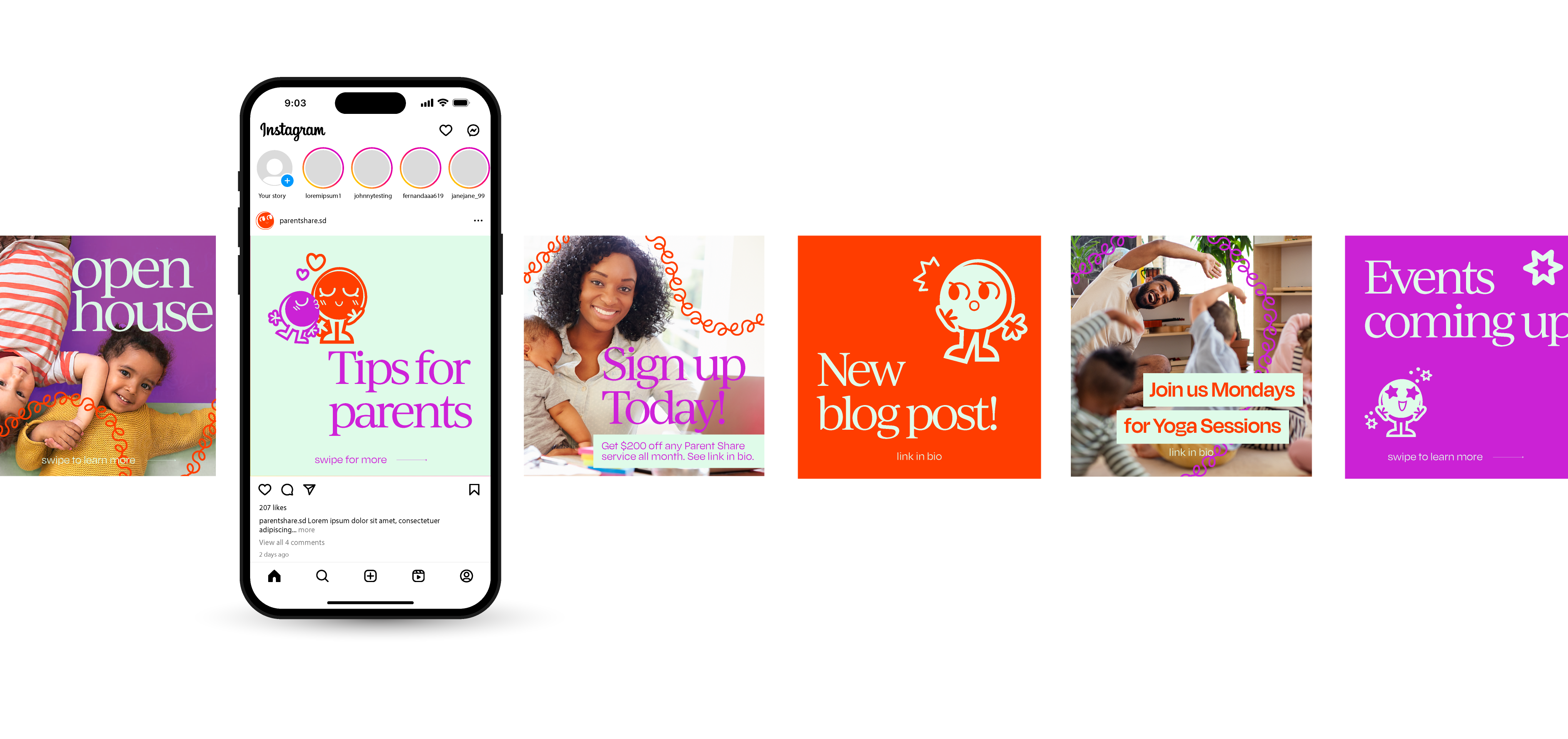
Parent Share is a co-working space that caters to working parents in San Diego, CA. Parents are provided with the support to have their children accompanying them while working or studying in a safe environment to help balance family and work life. Parent Share provides age-specific support from infant to early beginners making it possible for working parents to be present. As part of the design brief Parent Share requested a brand refresh which included a new logo, identity, print collateral, website, social media and environmental design.
The challenges of this project included creating an identity that appeals to not just professional working parents, but also to children. The voice and image of the brand centers children just as much as parents center their children in their lives.
Other considerations taken were the use of photography representing diverse children and families, the creation of a mascot character, incorporating primary colors to the brand, and execution of an identity that differentiates Parent Share from existing co-working spaces.
The color palette that I chose consists of a bright energetic orange and bright purple paired with a cool light green, the colors are fun and contemporary taking inspiration from daycare murals and cartoons.
These colors also allow for the brand to differentiate itself from competition within the co-work space. Overall, the brand has a fun and exciting vibe with a focus on what a child would enjoy to see, drawing from my own memories as a child and the spaces I still remember to this day.